This block allows you to create forms, which can be easily adjusted according to their desired function. You can change their appearance and the number and type of fields.
How to create a form
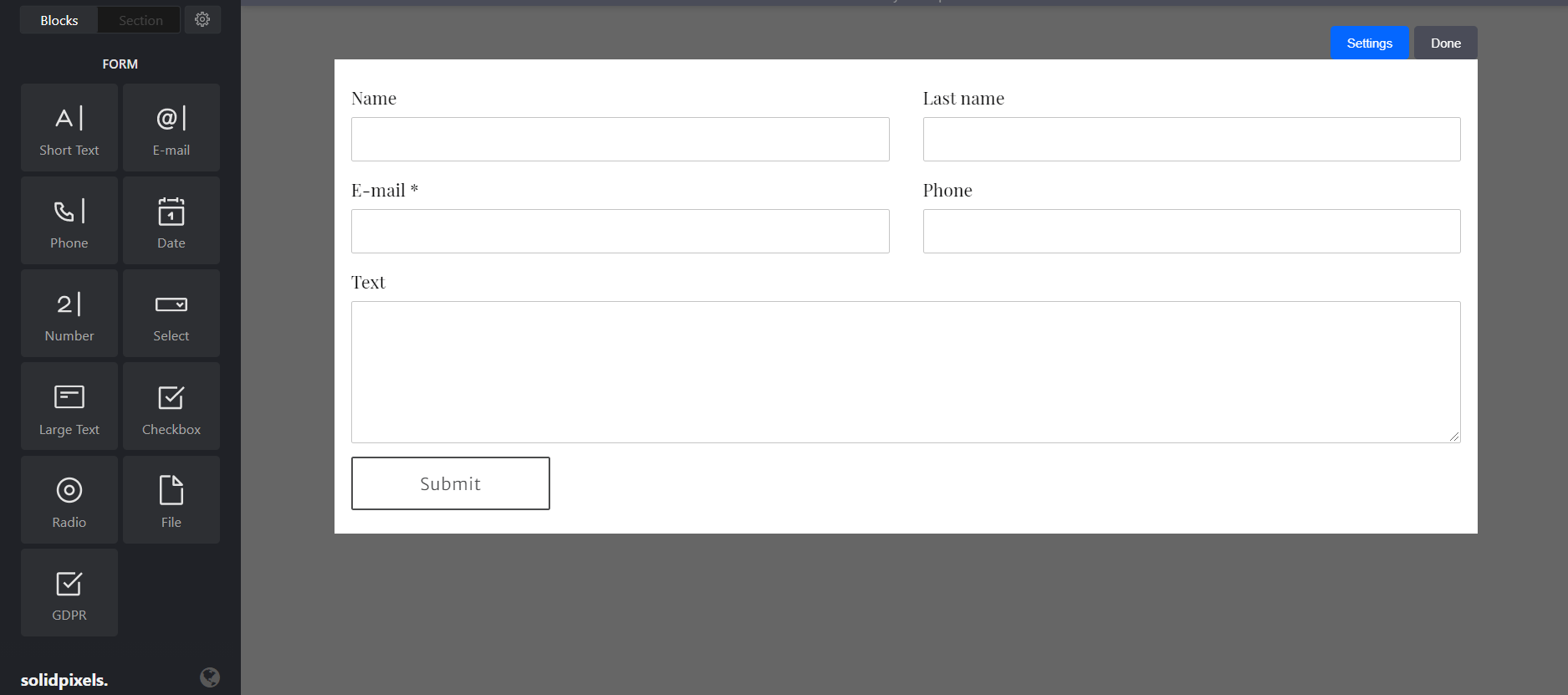
After dragging the form block to the page, a default form will appear. By clicking the centre of the block, you can adjust it using blocks. These blocks are inserted into the form the same way other content blocks are inserted on pages. You can add, delete and change the order of these blocks. Each of these blocks has its own settings.
Form settings
Forms have their own settings, which can be opened by clicking the blue “Settings” button.

General settings
In the upper part of the form settings tab, the form can be renamed. You can also set up the storing of data from the forms.
The next two options serve to send an email to both the website administrator and the sender of the form.
After the form is sent, you can choose if your own text will be displayed, or if the sender will be redirected to a different page of the website.
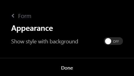
Form appearance
This setting offers an option to display the form in a style with background. This style can be adjusted in the Design tab.
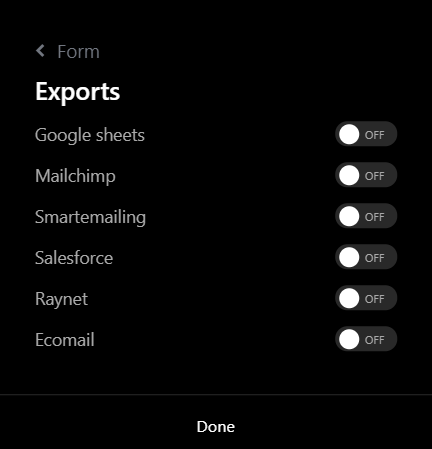
Export settings
In the Exports tab, you can choose to which services the collected information will be sent.
Advanced
In the advanced settings, the ID can be very useful to you. It is used to create a link using an anchor. You can learn more about setting up and using anchors in this article.
Blocks
Two types of blocks can be inserted into the form, form blocks and other blocks.
Form blocks
These blocks will create the fields the visitor will be filling out. They can be split into four categories - text blocks, checkboxes, select from options, and files.
Text blocks
These blocks include text field, email, phone number, date, number and long text.
The block you choose will then define what format and data type the user has to insert (e.g. number or email).
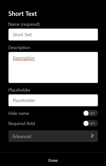
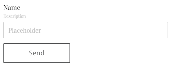
It is required to fill out the name of the field which appears above the field. Description will appear between the name and the field itself. Placeholder will be displayed as transparent text in the actual field.
You can also hide the name of the field, or set the field as required to be filled out.
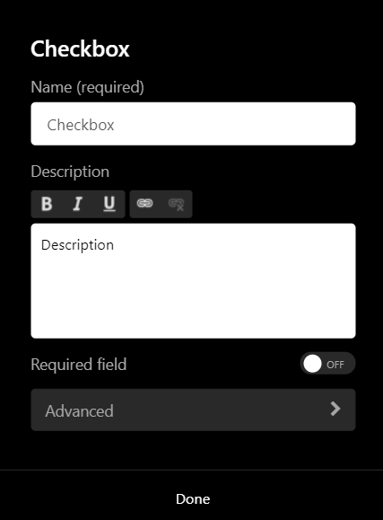
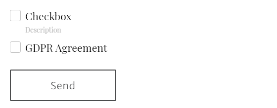
Checkboxes
These blocks include checkboxes and GDPR.
The checkboxes can have any name and description.
When it comes to the GDPR block, only the description can be changed. Alternatively, this agreement can be replaced by simple text, to which the user will agree by sending the form.
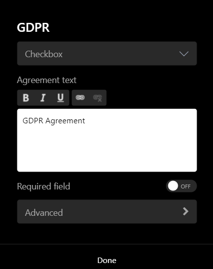
The text can be edited using the toolbar above the text field, you can also include links.
The field can also be set as required, so that the form won't be able to be sent without checking it.
Select from options
These blocks include select and radio.
The select block works as a scrolling menu. You can also change the placeholder text and hide its name.
The radio block will display the options as radio buttons, from which you can choose by checking one of them. Therefore, there is no space for placeholder text and its name cannot be hidden.
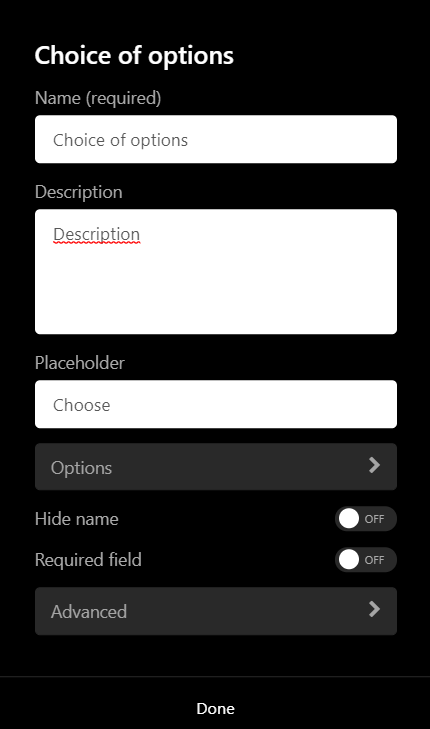

In the options tab you can add individual options that have to be separated into lines. The select block can also be set to have multiple options that can be checked.

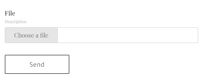
Files
File is the last type of block which allows the users to upload files into the form. These files will then arrive in your mail when the user submits the completed form.
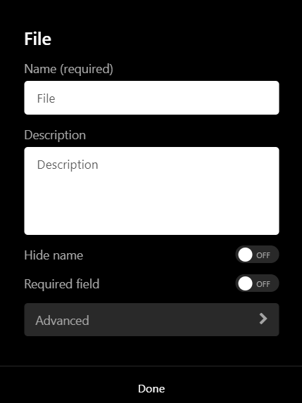
Similar to the previous blocks, you can also change its name and description. The name can be hidden and the field can be set as required.
Other blocks
Other blocks work the same way they work on regular pages and don’t offer any additional options. These blocks can be inserted between the fields of the form for additional information, or to adjust the appearance of the form.
These blocks are text, code, space and divider.
