An image is a block with lots of possibilities. Get to know the options of its settings, they will help you to create attractive content.
Image cards as navigation
An image set as Poster will display text over the image. You can use this to create cards, for example.
The cards allow you to present a large amount of information in a digestible way. Each box can also link to a separate page with detailed information. A thumbnail image preview with a caption allows people to find the information they are looking for and click through to more detailed information.
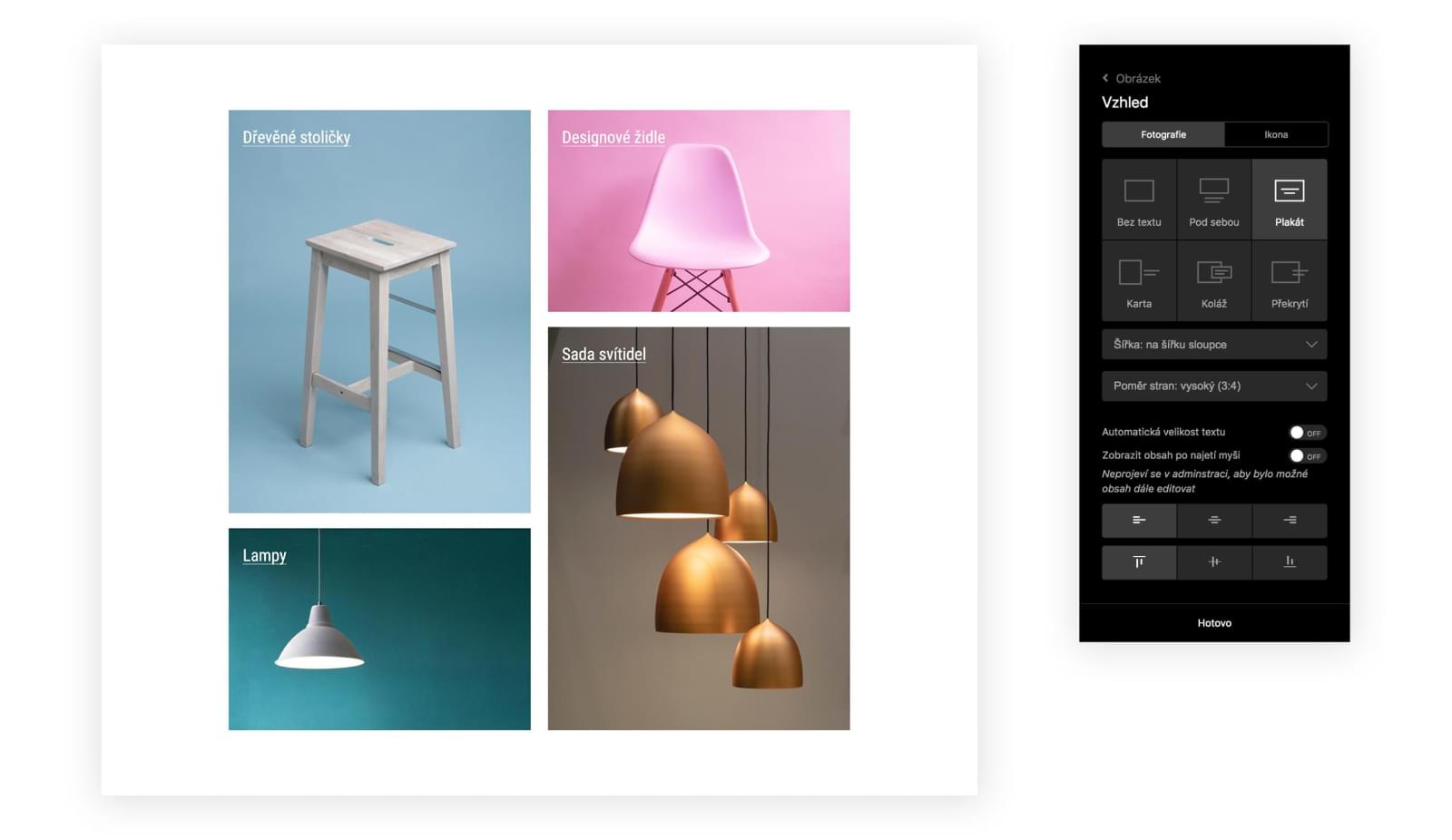
You can change the layout of the images and use different aspect ratios to create mosaics.
The advantage of the cards is their flexibility. You can use different sizes and arrangements. By combining different sized boxes you can easily create a visual hierarchy.
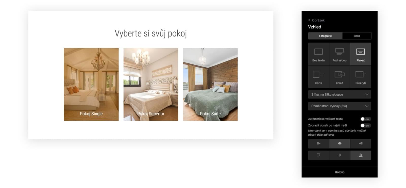
TIP: You can add a link directly in the image layout to make the entire area clickable. This will make the interaction more pleasant for visitors, as they won't have to click exactly on the link to get to further information.
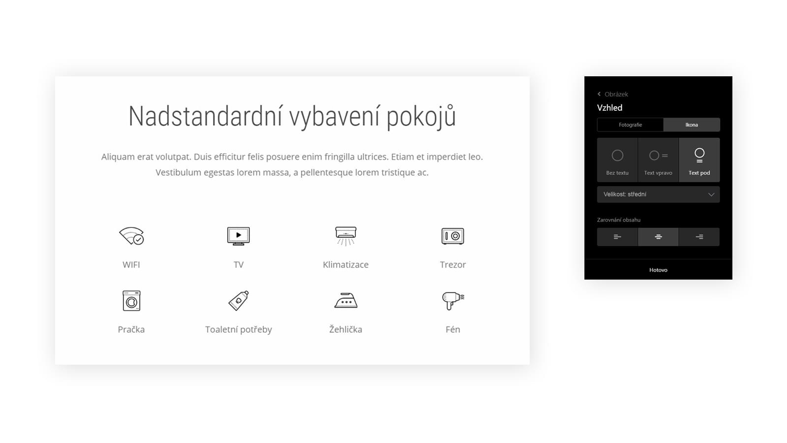
Image as an icon
Icons are another way to capture the user's attention and make content more visually interesting. Icons are easily recognizable, don't need to be translated, can complete the brand and are also easier to click.
However, only a small number of icons are universal enough to be understood in any situation without further explanation. That's why we often use them with descriptions. To work with icons, use the icon settings.
This way, the content will stay together even on smaller screens and always display correctly.
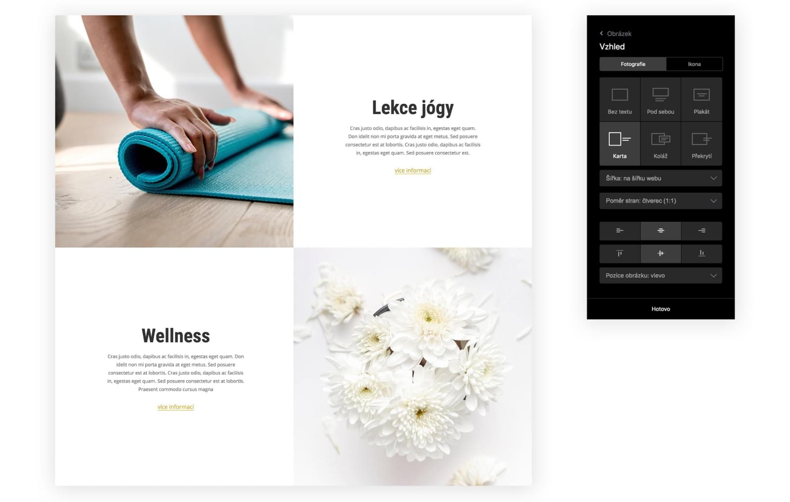
Alternating photos and text
The zigzag arrangement of content reflects one of the ways people scan the content of a page. This is the basis for places to put important page elements. The pattern also creates a rhythm that helps grab the visitor's attention.
It is based on the Z patter, which assumes that people first scan the content horizontally from left to right, then point diagonally down to the left, and then to the right edge. This creates the imaginary letter Z.
This layout is particularly suitable for pages with smaller amounts of text that are intended to emphasize a few key points.
More inspiration for the best websites
10 tips for faster work in solidpixels
You know that feeling when you discover a great gadget that saves you a lot of work and that you can't imagine your life without a month later? Well, today we're going to show you exactly ten of them. What are you going to do with all that free time?

From the life of a solidpixels ambassador: from Prague to Copenhagen and beyond with photographer Vojta Tesárek
Who are our ambassadors? How do they work, what do they enjoy and what are they currently working on? In the first part of our new segment, we talked to the talented photographer Vojta Tesárek.

20 microtips that will help you improve your website with virtually no work
What do the most successful websites have in common? Constant care and optimization. A regular habit of small adjustments can make a big difference over time. We've put together a checklist of 20 super simple changes that you can easily schedule into the coming weeks or months. You'll see them pay off.